Inference for Numerical Data

Using the data from the yrbss survey, we will now analyze the weight of the students in kilograms, stored in the weight variable in the yrbss data frame.
We can obtain the summary statistics of the variable by running the following code:
summary(yrbss$weight)To visualise the distribution of the weights, you may want to produce a box-plot for the weight variable by running the following code:
ggplot(data = yrbss, mapping = aes(y = weight)) +
  geom_boxplot()
Exercise 1
Another way of visualising the distribution of a variable is to look at the histogram of the data. Write code to produce a histogram for the weight variable.
We want to use the function ggplot(), specifying the data argument and the variable to go along the \(x\)-axis. Use geom_histogram() to produce a histogram.
ggplot(data = yrbss, aes(x = weight)) +
  geom_histogram()
## `stat_bin()` using `bins = 30`. Pick better value with `binwidth`.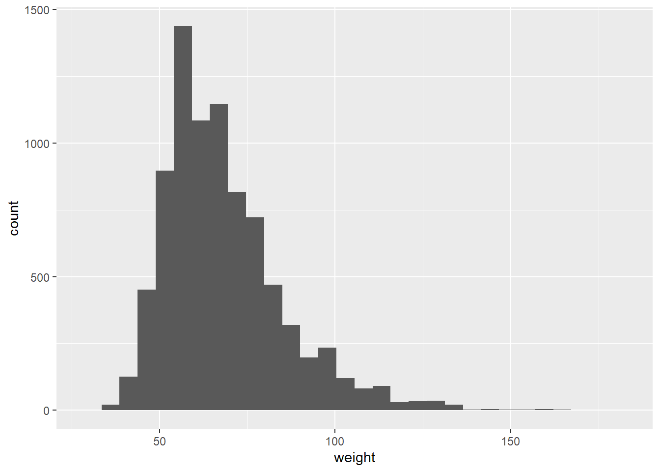
Look carefully at the shape of the graph, particularly towards the right.
Next, consider the possible relationship between a high schooler's weight and their physical activity. Plotting the data is a useful first step because it helps us quickly visualise trends, identify strong associations and develop research questions.
First, we will create a new variable physical_3plus, which will be coded as either "yes" if they are physically active for at least 3 days a week, and "no" if not, using the mutate() function.
yrbss <- yrbss %>%
  mutate(physical_3plus = ifelse(yrbss$physically_active_7d > 2, "yes", "no"))
Look at the code below that creates a boxplot. If you wanted to add another dimension to the boxplot, say, splitting it by some other variable, you would want to add an x = argument inside the aes bracket, making sure there's a comma between it and the y = weight part. Some variable name would follow the x =.
ggplot(data = yrbss, mapping = aes(y = weight)) +
  geom_boxplot()
Exercise 2
Make a side-by-side boxplot of physical_3plus and weight i.e. a boxplot with the physical_3plus variable on the x axis and the weight variable on the y axis. This will show side by side the boxplots of weights, comparing between the yes and no for physical_3plus.
With the aes() argument you want to specify that x = physical_3plus.
ggplot(data = yrbss, aes(x = physical_3plus, y = weight)) +
  geom_boxplot()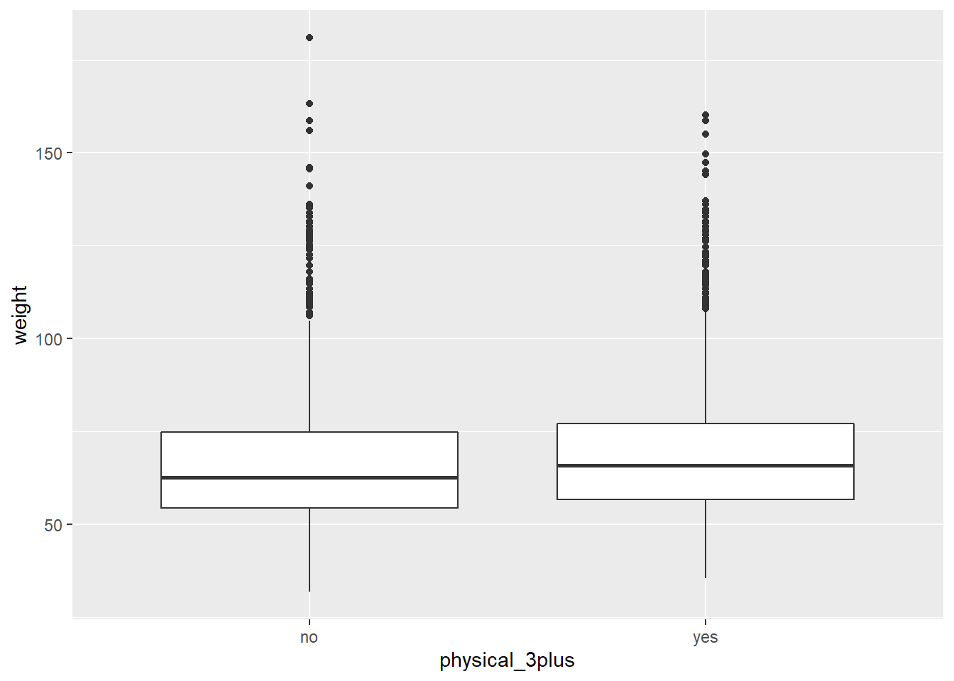
This is just an initial impression, so we don't decide anything for certain yet until we've done some analysis.
The box plots show how the medians of the two distributions compare, but we can also compare the means of the distributions using the same procedure that we used back in Exercise 1, except our summary this time is a mean rather than a count. Run the code below to see the mean weights of the students, separated by "yes" they are physically active 3+ days a week or "no" they aren't.
yrbss %>%
  group_by(physical_3plus) %>%
  summarise(mean_weight = mean(weight, na.rm = TRUE))
There is an observed difference, but is this difference statistically significant? In order to answer this question we will conduct a hypothesis test.